
The Overview tab
The Overview tab is automatically created for every table connected to the DQC Platform. It provides a high-level summary of the table’s context, validation activity, and overall data quality trends — making it the starting point for understanding the health of your data.
Table description
At the top of the tab, you can add a description of the table to give context for other users. This description can be:
 Entered manually
 Generated automatically using the AI Assistant
 Help other users understand the content and purpose of the table
Quality trend chart
At the bottom of the Overview tab, you’ll find a trend visualization that shows how data quality has evolved over time.
The chart includes:
Issues – Total number of issues found in the table per run
Quality Ratio – Percentage of valid rows vs. total evaluated rows
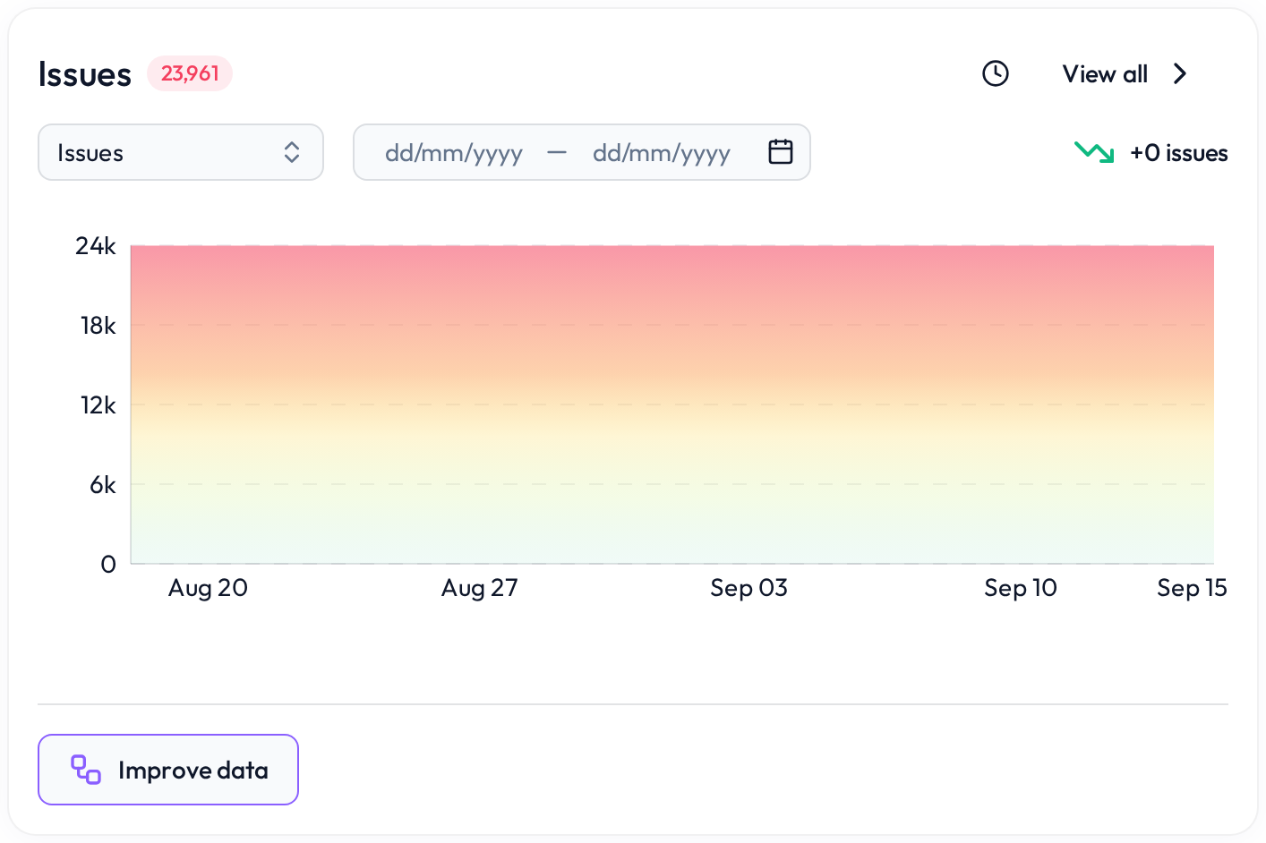 Track improvements or spikes in data issues
You can also select a custom date range to narrow the view to a specific time window — ideal for reporting or analyzing recent changes.
 Notes
Notes
The Overview tab is read-only and updated automatically after each data check
Description and metadata help improve understanding for teams working across datasets
Learn more: Working with the Rules tab, Rule prediction and how it works, Profiling tab